 My Kind of People
Brand Platform
My Kind of People
Brand Platform
We celebrate the unique, the upstart, the creator,
the inventor, the dreamer.
The Story
Lansing, Michigan is a great place to live–and it has the potential to
become outstanding. By investing in our positive qualities and seizing
opportunities, every Lansing neighborhood, corridor, corner and pocket will
become its best self.
We see Lansing’s future so clearly: ample housing options, gleaming
public spaces, pride in our city overflowing. But we’re not there yet.
Of course, there is always room for improvement. At the same time, we
know we have all the tools necessary to make our goals a reality. We have a
great foundation on which to grow.
The following brand platform outlines what Lansing is and can become, and
how we’ll use our positive assets to get there.
Lansing is poised to do great things. In sharing these guiding principles
and outlining our goals, we hope you’ll see this vision, too.
Lansing is a hub for the new American Dream—the next generation of urban
revitalization. Authentic. Self-assured.
Mission
To empower residents, businesses and communities to thrive in a city they are
proud to call home.
Vision
Lansing will be its best self: a diverse, dense, livable, responsible and
welcoming environment.
Read the whole vision at
lansingforward.com
Values
Equity
We prioritize fair and impartial treatment for residents of all
identities and statuses.
City Design
Our public spaces are safe, welcoming and walkable. They promote
residents’ health, happiness and well-being.
Multiculturalism
We celebrate our cultural diversity and welcome new residents from all
backgrounds.
Education
Our education system is the foundation for our region’s economic, social
and residential success. We are committed to supporting and furthering
educational opportunities for all residents.
Community
Our residents have pride in both their individual neighborhoods and
the city as a whole. Meaningful connections are intertwined between
neighbors and friends across the region.
Here’s to celebratIng our people. Instilling pride. Making our vision
a reality.
Positioning
Lansing is a place where all types of people can settle down and thrive.
As the economic and cultural driver of mid-Michigan and the political driver
of the state, it opens the door to endless professional and social
opportunities.
Value Proposition
A resident’s dollar stretches further in Lansing, as compared to
surrounding areas. Residents have the opportunity to do more with less, and
the city provides them with a variety of things to do. There is opportunity
for all people to live a financially and culturally creative, innovative,
unique and prosperous life.
A city that not only sees its potential, but reaches it.
Welcome to
Lansing's Lifestyle Brand
This brand is intended to help the city support and celebrate the great
things that are happening everywhere we look. Inspired by the vision, this brand
both supports our unique position and culture, and forms the basis for multiple
types of marketing and outreach.
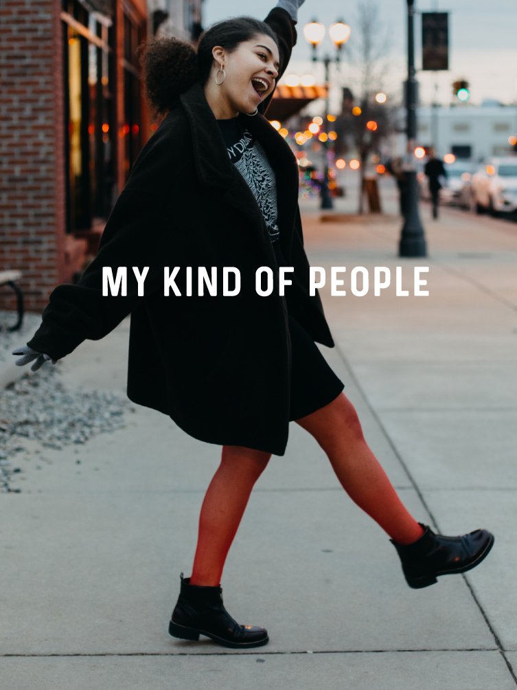
My Kind of People
If there’s one thing that sets our city apart, it’s our people. Welcoming
people. Authentic people. Wake up early, three cups of coffee, work until your
hands are calloused kind of people. Family-style meals, wave at the school bus,
know your neighbors kind of people. Thrift store chic, Friday night concerts,
never stop creating kind of people. Forever learning, forever growing, forever
proud kind of people.
This is the Lansing we want the world to know.
Tone of Voice
welcoming, honest, supportive, optimistic, down-to-earth,
forward-looking.
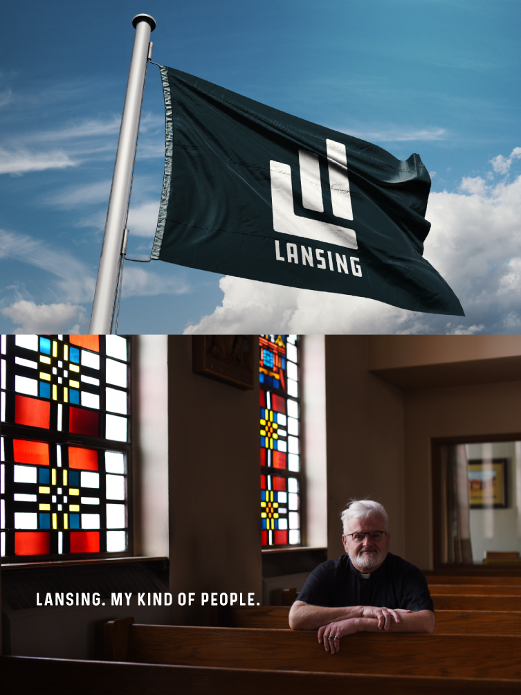
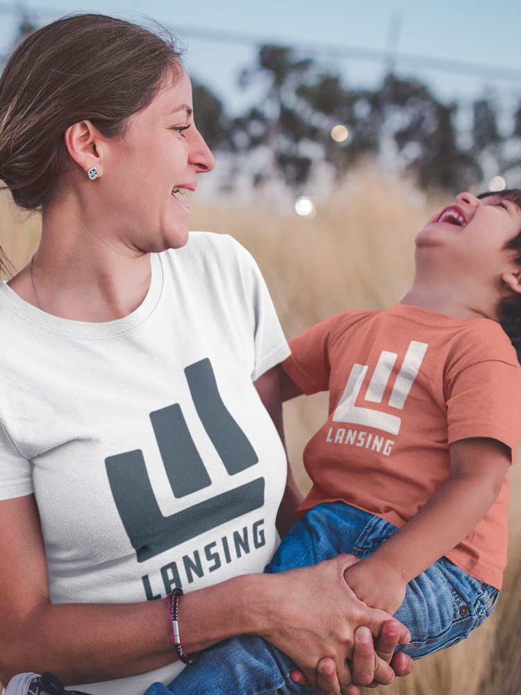
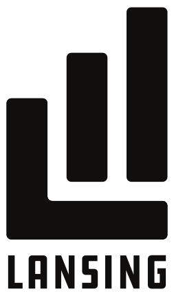
Logo
Lansing’s lifestyle logo is not meant to replace the city seal; there will
always be a need for our formal seal. Instead, this new mark allows us to show
our casual side when warranted. Although the primary logo should be used most
often, we have provided a horizontal logo and icon as alternative
representations.
The logo may be used in industrial blue, black, or white.
Primary
Icon

Horizontal Alternative

Sizing
Minimum size requirements have been established to ensure legibility of the
logo, and recognition of the brand. The application in which the logo is being
used should guide the usage size—using your discretion, and the standards
provided within this book. Proportions of the logo should never be altered, not
under any circumstances.
Spacing
Always maintain the minimum distance between any part of the logo and any
other elements appearing on the page—this minimum distance should be equal to
the height of the icon. This minimum distance also applies to the spaces
allowable between the edge of the page and any part of the logo. No other
elements—copy, photos, artwork, etc.—should be placed within the space indicated
or behind the logo (unless a photographic background is being used on the
majority of the page).
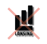
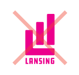
Logo Misuse
The composition of a logo is very specific, and important for proper
recognition of your brand. It is very important that you do not attempt to
recreate the logo, in any form. Changing the logo’s fonts or colors, stretching
any elements, or adding and subtracting elements in any form is prohibited. The
following are a few common examples of logo misuse.
Distorted Proportions

Drop Shadows
Distracting Background
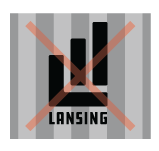
Wrong Color
Co-Branding
Often, the logo will be required to co-exist with logos from partner
organizations. This allows you to support important causes or align with other
efforts that reflect Lansing’s values. It is generally important to use the
primary mark in these instances.
Product dominance
When the Lansing brand is the feature, it should be larger than the
partner logos. All logos should rest on the baseline created by the
“L.”
Product equity
When multiple, equal logos need to be displayed, best practice is to
ensure that have similar visual size, and be aligned on a center
axis.
Product endorsement
When Lansing is featured as an endorsement or a promotion, it can be
encapsulated in a “label” to set it apart on a larger piece of artwork,
such as a poster. Endorsement language such as “supported by,” “made
in,” or “built in” can be appropriate.
Typography
To keep a consistent look and feel, use the font Roboto when creating branded
content. It is available for download on Google Fonts.
Headlines are set in Prequel Regular,
which can be found at Phitra Design.
Use uppercase for headlines:
Prequel
Use this for body copy:
Roboto
Roboto Bold
Roboto Bold Italic
Color Palette
Lansing’s stylized brand is comprised of one primary color—midnight, and
three secondary colors—olive, spice, and plum. The logo should only be used
in white, black, and midnight. The secondary colors can be used to support
the brand, i.e. t-shirt color and other promotional items. Always use the
color breakouts shown at right.
It is normal for color variations to occur between coated and uncoated
stocks and among various digital printing devices, particularly in-office
printers.
The logo and color palette can be provided to you in various color
spaces: PMS, full color/four color/CMYK, RGB, black, and reversed. Use the
full-color/4 color/ CMYK logo when printing digital or 4 color offset.
Use RGB colors only for Web, television, or other “screen” devices. RGB
color breaks are much more limited than full color/4 color/CMYK color breaks
and, therefore, these tones may vary widely from the printed colors.
PLEASE NOTE: Colors vary depending upon printing device
and monitor screen. Should you have questions or should additional
considerations need to be made, please contact Redhead Design Studio at
517-853-3681 for guidelines.
Primary
Industrial Blue
- PMS: 547 C
- CMYK: 90, 62, 58, 55
- RGB: 14, 52, 58
Secondary
Olive
- PMS: 451 C
- CMYK: 42, 41, 71, 13
- RGB: 143, 128, 77
Spice
- PMS: 7417 C
- CMYK: 5, 80, 81, 0
- RGB: 228, 88, 64
Twilight
- PMS: 1535 C
- CMYK: 48, 80, 32, 10
- RGB: 136, 76, 115
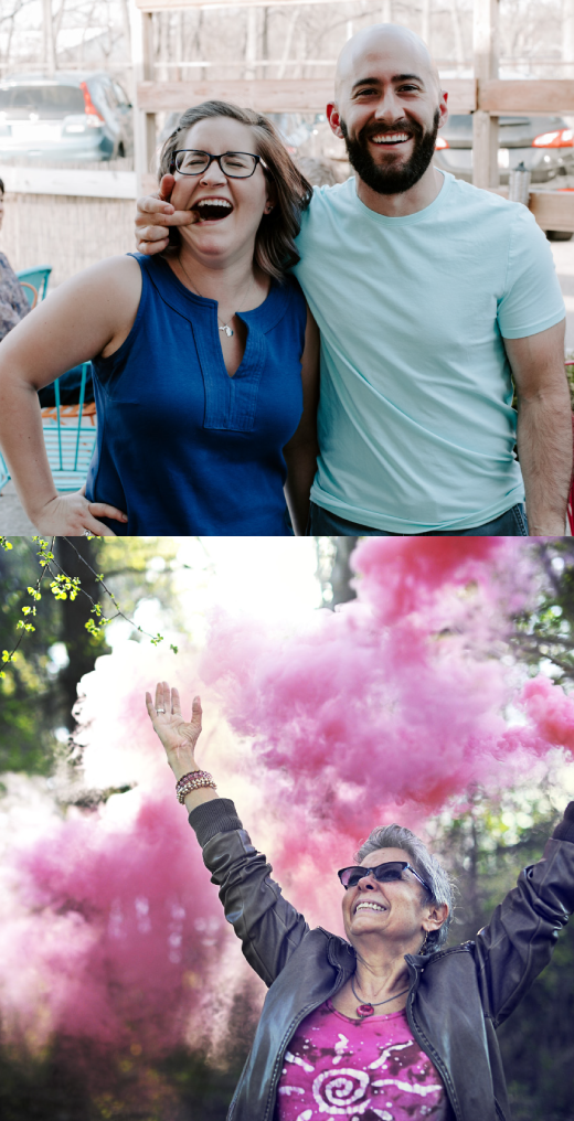
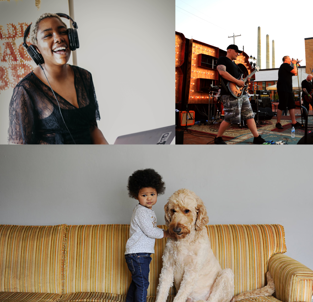
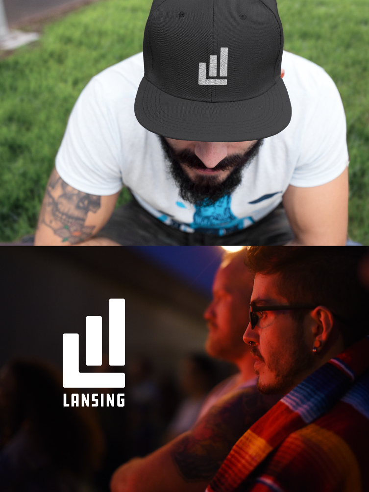
Photography Styles
While the visual style of the photos might be different, they all set the
right tone and mood of Lansing. When showcasing the variety of people and places
that set Lansing apart, portray a sense of optimism, passion and individuality
to mimic the city's broader values. This is accomplished by catching authentic,
warm and welcoming expressions, as well as capturing moments that aren't usually
captured.
Campaign Assets
Need logo files?
Contact:
Valerie Marchand
Communications Manager
517-483-4179
Valerie.marchand@lansingmi.gov
 My kind of people